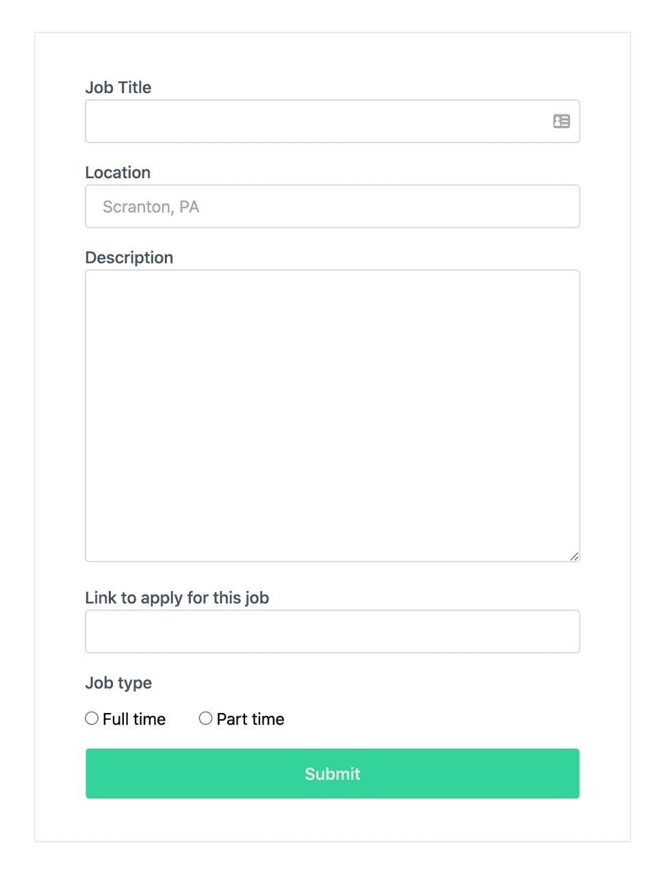
In this article, you will learn how to build a highly functional and clean form with validation in React using Tailwind CSS and React Hook Forms.
The steps you will take to do this will be as follows
- Setup Tailwind CSS
- Install React Hook Forms
- Create the JSX tags for the React Hook Form and add Tailwind CSS classes to style
If you already have Tailwind CSS and React Hook forms setup, you can skip down to the section on creating the JSX for the React Hook Form.
Setup Tailwind CSS
To keep this article focused, you can follow the steps on Tailwind’s website to set up Tailwind CSS with React.
Install React Hook Forms
You will use React Hook Forms to easily add form validation so that you can focus on styling. In this example, let’s create a form to post a job
npm install react-hook-formCreate the JSX tags for the React Hook Form and add Tailwind CSS classes to style
To start, you will do the usual boilerplate imports and the useForm hook from React Hook Form to do your form validation
import React from "react";
import { useForm } from "react-hook-form";

const JobForm = () => {
  return;
  <form></form>;
};

export default JobForm;
Next, creating the Form tag with a simple input field. that will be enclosed within the return. I’ll go over what each of the Tailwind CSS classes does afterward
<form
  className="w-full max-w-lg m-auto py-10 mt-10 px-10 border"
  onSubmit="{handleSubmit(onSubmit)}"
>
  <div>
    <label className="text-gray-600 font-medium">Job Title</label>
    <input className="border-solid border-gray-300 border py-2 px-4 w-full
    rounded text-gray-700" name="title" placeholder="Full Stack Developer,
    Backend Engineer, etc." autoFocus ref={register({ required: "Please enter a
    job title" })} /> {errors.title && (
    <div className="mb-3 text-normal text-red-500 ">{errors.title.message}</div>
    )}
  </div>

  <button
    className="mt-4 w-full bg-green-400 hover:bg-green-600 text-green-100 border shadow py-3 px-6 font-semibold text-md rounded"
    type="submit"
  >
    Submit
  </button>
</form>
In the <form> tag, you will be using the following classes
max-w-lgsets the max-width to 32rem to prevent our form from filling the entire width of the screen=m-autocenters our form on the screen by setting margins to autopy-10sets a vertical padding on the form to 2rem. You can adjust this as you see fitpy-10sets a vertical padding on the form to 2rem. You can adjust this as you see fitpx-12sets a horizontal padding on the form to 2rem. If you decide to set your vertical and horizontal padding to the same values, you can combine this into one css class asp-10for example *mt-10sets a top margin on the form to 2.5rem
Let’s create a label tag next and style it with Tailwind CSS classes
<label className="text-gray-600 font-medium">Job Title</label>text-gray-600sets the shade of gray to a medium to darker gray. Lower values start from 50 and go to 900 increments of 100. The higher the number, the darker the color.font-mediumsets the font weight to right in the middle of the light to bold weight spectrium
Next, you will create and style the input tag. You will add a ref attribute to register it into the React Hook Form hook. This will make the input field’s value available for form validation and submission.
Note that the required parameter is a form validation rule. This indicates that this field is a required input. You can also specify a message that will be displayed to the user if they leave the field blank and submit the form.
<input className="border-solid border-gray-300 border py-2 px-4 w-full rounded
text-gray-700" name="title" autoFocus ref={register({ required: “Please enter a
job title”, })} />bordersurrounds the input with a borderborder-solidindicates that you want a solid style borderborder-gray-300applies a light gray color to the border. You can useborder-blackif you prefer black as the colorpy-2adds a vertical padding of .5.rempx-4adds a horizontal padding of 1remroundedadds a border-radius and makes the corners rounded. You can use a range of classes to specify how rounded you would like the input field’s corners to be.
To finalize this input field, add a conditional <div> tag to surface any input errors captured. React Hook Form will populate the errors object should any of the form validation rules fail. Place this immediately after the input tag
{
  errors.title && (
    <div className="mb-3 text-normal text-red-500 ">{errors.title.message}</div>
  );
}
The final input field with the conditional <div> to display form validation errors should now look like this
<input className="border-solid border-gray-300 border py-2 px-4 w-full rounded
text-gray-700" name="title" autoFocus ref={register({ required: "Please enter a
job title" })} /> {errors.title && (
<div className="mb-3 text-normal text-red-500 ">{errors.title.message}</div>
)}
Similarly for the other fields, you can simply copy and paste the label and input tags. Then, change the name of the input fields and labels appropriately This brings you to code snippet below.
<form
  className="max-w-xl m-auto py-10 mt-10 px-12 border"
  onSubmit="{handleSubmit(onSubmit)}"
>
  <label className="text-gray-600 font-medium">Job Title</label>
  <input className="border-solid border-gray-300 border py-2 px-4 w-full rounded
  text-gray-700" name="title" placeholder="Sales Engineer, Partner Engineer,
  etc." autoFocus ref={register({ required: "Please enter a job title" })} />
  {errors.title && (
  <div className="mb-3 text-normal text-red-500 ">{errors.title.message}</div>
  )}

  <label className="text-gray-600 font-medium block mt-4">Location</label>
  <input className="border-solid border-gray-300 border py-2 px-4 w-full rounded
  text-gray-700" name="location" type="text" placeholder="Scranton, PA"
  ref={register({ required: "Please enter a location", })} /> {errors.location
  && (
  <div className="mb-3 text-normal text-red-500 ">
    {errors.location.message}
  </div>
  )}

  <label className="text-gray-600 font-medium block mt-4">Description</label>
  <textarea className="border-solid border-gray-300 border py-20 px-4 w-full
  rounded text-gray-700" name="description" rows={5} cols={5} ref={register({
  required: "Please enter a job description", })} /> {errors.description && (
  <div className="mb-3 text-normal text-red-500 ">
    {errors.description.message}
  </div>
  )}

  <label className="text-gray-600 font-medium block mt-4">
    Link to apply for this job
  </label>
  <input className="border-solid border-gray-300 border py-2 px-4 w-full rounded
  text-gray-700" name="link" type="text" ref={register({ required: "Please enter
  a link" })} /> {errors.link && (
  <div className="mb-3 text-normal text-red-500 ">{errors.link.message}</div>
  )}
</form>
The next thing you will do is create the two radio input tags to let users specify whether they are posting a full time or part time job.
<label className="text-gray-600 font-medium block mt-4">Job type</label>
<label className="inline-block">
  <input className="mt-4 mr-1" name="jobtype" type="radio" ref={register({
  required: "Please select a job type" })} /> Full time
</label>

<label className="ml-8 inline-block">
  <input className="mt-4 mr-1" name="jobtype" type="radio" ref={register({
  required: "Please select a job type", })} /> Part time
</label>

{errors.jobtype && (
<div className="mb-3 text-normal text-red-500 ">{errors.jobtype.message}</div>
)}- In the above code, use an initial
<label>tag to specify the type of input - A subsequent
<label>tag is used to label the radio input button - The
<input>tag is added as a child of the<label> - The
<inline-block>class is added to display the radio input side by side with its label
Finally, the last thing is the submit button.
<button
  className="mt-4 w-full bg-green-400 hover:bg-green-600 text-green-100 border py-3 px-6 font-semibold text-md rounded"
  type="submit"
>
  Submit
</button>mt-4is used to add a top margin of 1remw-fullmakes the button extend the full width of the containerbg-green-400sets a slightly lighter green background to the buttonhover:bg-green-600makes the button change to a darker green on hover to provide some helpful feedback tot the user that this is a buttontext-green-100Adds the lightest tint of green to complement the green you used for the background color of the buttonpy-6andpy-3add vertical and horizontal padding to the button respectively to make it easier to clicktext-mdsizes the text to medium size
Your completed and styled form component should now look like the following. Handling submission of this form is outside the scope of this tutorial, but I’ve added in a placeholder so you can take it the rest of the way
import React from "react";
import { useForm } from "react-hook-form";

const JobForm = () => {
  const { register, errors, handleSubmit } = useForm();

  const onSubmit = async (data) => {
    const fields = { fields: data };
  };

  return (
    <React.Fragment>
      <h1 className="text-center text-4xl font-semibold mt-10">Post a job</h1>
      <form
        className="max-w-xl m-auto py-10 mt-10 px-12 border"
        onSubmit={handleSubmit(onSubmit)}
      >
        <label className="text-gray-600 font-medium">Job Title</label>
        <input
          className="border-solid border-gray-300 border py-2 px-4 w-full rounded text-gray-700"
          name="title"
          placeholder="Full Stack Developer, Backend Engineer, etc."
          autoFocus
          ref={register({
            required: "Please enter a job title",
          })}
        />
        {errors.title && (
          <div className="mb-3 text-normal text-red-500">
            {errors.title.message}
          </div>
        )}

        <label className="text-gray-600 font-medium block mt-4">Location</label>
        <input
          className="border-solid border-gray-300 border py-2 px-4 w-full rounded text-gray-700"
          name="location"
          type="text"
          placeholder="Scranton, PA"
          ref={register({
            required: "Please enter a location",
          })}
        />
        {errors.location && (
          <div className="mb-3 text-normal text-red-500 ">
            {errors.location.message}
          </div>
        )}

        <label className="text-gray-600 font-medium block mt-4">
          Description
        </label>
        <textarea
          className="border-solid border-gray-300 border py-20 px-4 w-full rounded text-gray-700"
          name="description"
          rows={5}
          cols={5}
          ref={register({
            required: "Please enter a job description",
          })}
        />
        {errors.description && (
          <div className="mb-3 text-normal text-red-500 ">
            {errors.description.message}
          </div>
        )}

        <label className="text-gray-600 font-medium block mt-4">
          Link to apply for this job
        </label>
        <input
          className="border-solid border-gray-300 border py-2 px-4 w-full rounded text-gray-700"
          name="link"
          type="text"
          placeholder="https://www.customerengjobs.com"
          ref={register({
            required: "Please enter a link",
          })}
        />
        {errors.link && (
          <div className="mb-3 text-normal text-red-500 ">
            {errors.link.message}
          </div>
        )}

        <label className="text-gray-600 font-medium block mt-4">Job type</label>
        <label className="inline-block">
          <input
            className="mt-4 mr-1"
            name="jobtype"
            type="radio"
            ref={register({
              required: "Please select a job type",
            })}
          />
          Full time
        </label>

        <label className="ml-8 inline-block">
          <input
            className="mt-4 mr-1"
            name="jobtype"
            type="radio"
            ref={register({
              required: "Please select a job type",
            })}
          />
          Part time
        </label>

        {errors.jobtype && (
          <div className="mb-3 text-normal text-red-500 ">
            {errors.jobtype.message}
          </div>
        )}

        <button
          className="mt-4 w-full bg-green-400 hover:bg-green-600 text-green-100 border py-3 px-6 font-semibold text-md rounded"
          type="submit"
        >
          Submit
        </button>
      </form>
    </React.Fragment>
  );
};

export default JobForm;
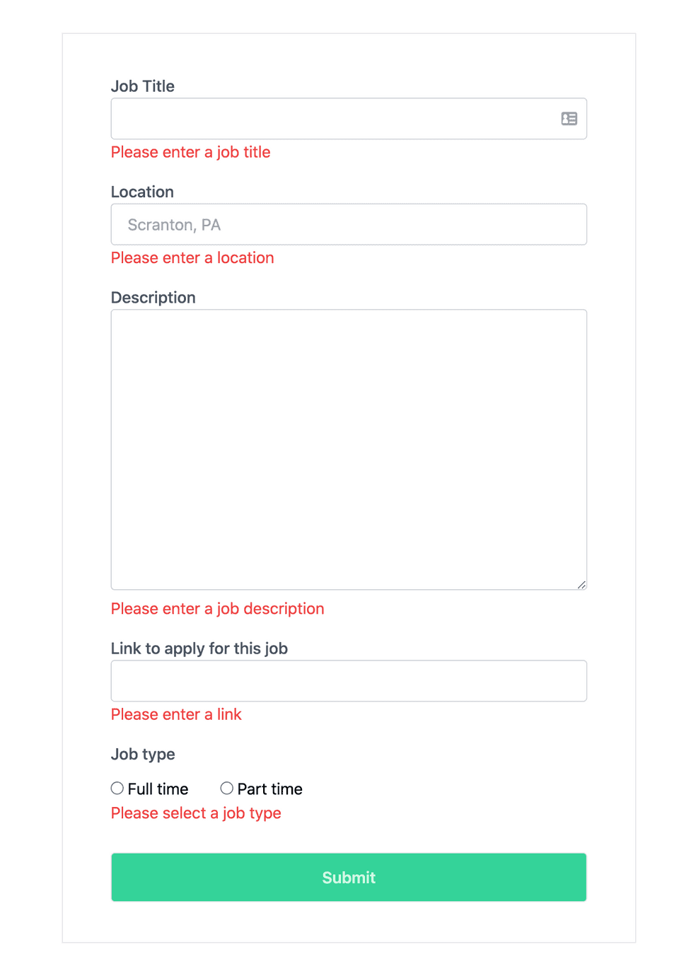
The final form with validation errors that will trigger if the form is submitted with empty fields
Did this post help you or do you have any comments or questions? Email me at hey@tonyvu.co or Tweet me at @tonyv00

